
Shuttle Tracking
A bus tracking app that provides a better bus experience for students.
Time
Jan 2022 - Mar 2022
8 Weeks
Tools
Figma, Notion
Team
Yao Wang, Yi Luo
My Role
Product Designer
UX Researcher
UX/UI Designer
Deliverables
User interview
User journey mapping
User Flow
Wireframes
High-Fi Prototypes
Usability Testing
Background
We started our projects with our personal experiences as students and observations from other college students when taking the school buses for campus transportation. Looking into the current user experience of taking a school bus, we realize that there is a gap between getting accurate bus route information and having a streamlined app experience.
Challenge
How to get people more physically activated during self-isolation?
While there are many school shuttle apps on the market, there is still a lack of satisfying mobile apps for students in universities. Through in-depth research, we found that most universities do not offer accurate shuttle information to students, and that has led to more time consuming and disturbing trip experiences for students. As the design has led to low user retention and poor satisfaction rate, our team wants to offer a solution to support students need while taking the bus.
Solution
An online fitness community for busy professionals who live alone
The problems would be solved by creating an app that includes social function to connect users with friends and community with a series of game mechanics to motivate users, as well as personalized options and visualized data for users to be more autonomous during workouts.
Home & Search Page
01
Accurate Real-time Info
Search your destination and check out the fastest routes. You can notify the driver in advance so you won’t miss a bus.


Add stops & Customize the trip
02
Critical Data Visualization
Discover places and add a stop to your trip for future travels.
All buses & Stops Page
03
Variety of Travel means
Save time with automatic information on buses and other transportation means based on live traffic conditions. You can find the closest stop near you.


My Profile & Schedule page
04
Customized Options
Easily set up your weekly schedule by importing from external calendars and get reminded of your upcoming trips.

Research
Understand the Problem
Our team started out by researching the background and struggles in order to understand our users and what areas we can improve. Based on our initial prompt and our preliminary secondary research, we listed the problems and initial questions to guide us in the design process.
Current problem
Study the Current Process to take a bus
When taking a bus, students usually need to look at the bus schedule to figure out when the bus will come and whether they should wait or walk to class before it is too late. It is always unpleasant when the students open the existing app and find the bus not moving for 1 hour.
Looking into the current user flow with existing apps, we discovered 4 major steps in completing a ride and identified the frictions and pain points that may occur during a ride.

One discovery is that when users do not have access to real-time bus information, they go back and forth with the app during the waiting time, which leads to a low satisfaction rate and a disturbing experience.
Initial Design Question
How do we improve the current experience?
We ran a brainstorming session to uncover any related goals and aspirations of the product at large. Then we define and align on the specific problem that needs to be solved. We narrowed down our problem statement and came up with the initial design question:
How Might We Design a school bus app that is easy and fast for students?
User Interview
We went on 1-1 interview with current college students to uncover the pain points and opportunities. 100% of students have experienced difficulty and frictions when using the existing school bus apps.

Key findings


Personas
Synthesize the Research
After understanding users’ needs, experiences, and pain points, we created user personas as our design reference.


Secondary Research
We researched the popular public transit apps on the market as well as some platforms for universities shuttles. to study the critical features to include.
Commonalities
We found some commonalities among those popular apps:

User Journey Map
When Taking a Bus
Later on, to better build empathy with our users and to establish a shared vision of the user journey when taking a bus, I created a user journey story based on previous insights. I want to visually present the story and map out the painpoints and potential design opportunities through this process.
Define
Set the Design Framework
With the research in mind, we defined our design goal in the ideation process.

Reframe the initial design question:

How might we design a school bus App that offers instructive, accurate, and personalized bus scheduling for students?

Ideation
Define the Scope
We used the research findings to transition into the design.
Brainstorming
We brainstormed many solutions for the issues we found from our research and transferred them into features we want to create in the mobile app. All the features are classified into three design principles we defined based on the user’s needs: Instructive, Accurate, and Personalized.

Redefine
User Task flow
Based on our design principles, we redefined the ideal user task flow for taking the school bus. Every step will be simple, accurate, and easy to follow. It will create a more convenient and smooth experience for shuttle users. Furthermore, they can customize their own account based on personalized needs and habits.


Design
Iterations and design decisions
01
User Flows
As we summarized our ideas and defined the new user task flow, we produced the initial design based on the following three main user flows. We use one flat landing page without a bottom navigation bar to make the structure more simple, clean, and straightforward. Different from other public transport systems, the school bus system is more simple with fewer lines and stops, so we design it with clear flows, hierarchical display, and no overwhelming information.
01
Navigation Search
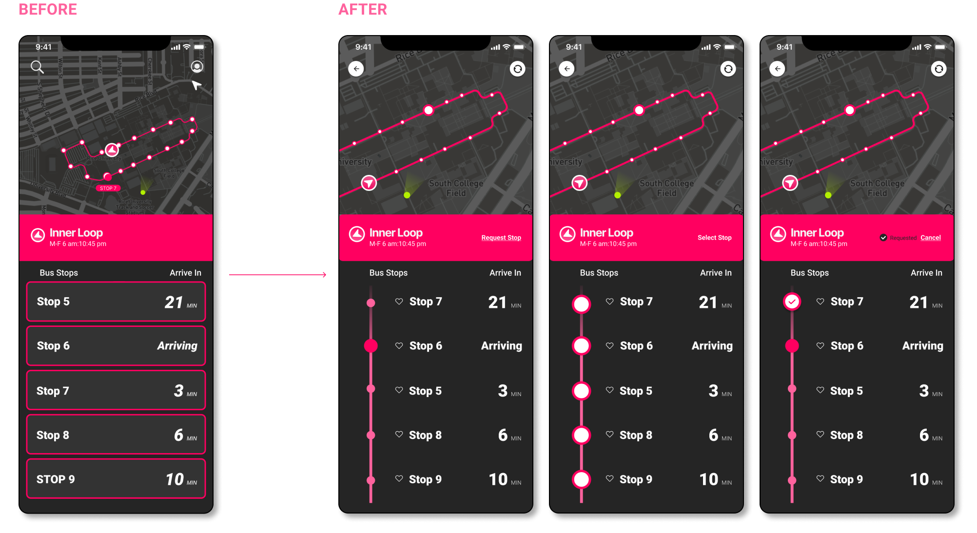
To provide accurate instructions, we added a real-time track feature so users can search to get the navigation when they’re not very familiar with the campus. They can select the best route and get clear instructions on the trip. In addition, users can notify bus drivers of the stop they want to get on and get off in advance to make sure that they will not miss the bus.

02
Explore All Buses and Stops
For users who want to review more detailed information about a bus line or stop, they can check “all buses” and “all stops” from the access on the landing page. To enter one specific bus line or stop, they can either click the icon on the map or click the card.

03
Customize My Own Account
The new design provides a personal account for users to customize their saved places and schedules. Based on students’ needs, class schedules from canvas or other calendars can be imported into account for users to check or set reminders. They can also add their events to the schedule manually to save time in the future.

02
Usability Test

We conducted 2 rounds of usability testing. To better understand the user experiences, we created 3 tasks for users to complete in wireframe according to 3 main features. By recording and analyzing the test results of each task and the general design, we concluded key findings as the following issues:

Feedback Summaries

Structure the usage context
According to the usability test feedback, we learned the fact that more than half of school bus usage contexts are frequent trips. Users usually use one or two bus lines for daily classes they’re very familiar with. Different from the occasional trips, the search to navigate flow is unnecessary because users only care about the bus location and arrival time. They need a more convenient and straight flow to access the useful feature easily. Therefore, we structured the usage context to differentiate the frequent and occasional cases.

New User Flow
Based on the two usage contexts, we re-organized our design as two main user flows because they have different ways to use the app: one serves frequent users who take the same bus line on a regular basis, and another serves the occasional users or users on occasional trips who are not familiar with the destination location and transportation options.

Iteration
Through analyzing usability test and rethinking user flow, we iterated 2 rounds to improve the design.
01
Improve the information hierarchy to be more clear, understandable and flexible

Adjust text size, button location, and layout to improve information hierarchy on landing page, so that the important information will be prioritized to be caught.

Enhance data visualization to make sure users can easily understand multiple information and quickly get the one they care about.

Enhance data visualization to make sure users can easily understand multiple information and quickly get the one they care about.
02
Provide convenient and straightforward flows for frequent users

Add more visualized information on the map because most users prefer to read from the map directly according to the user testing.
Stop page:
Refine the format and layout of stop list to make it more clear
Add bus icons to show which bus is related to the stop
Let users save or unsave stops from this page
Bus page:
Simplify the bus card for necessary information
Add multiple selection feature so that users can review multiple bus lines at the same time
03
Enhance personalized features to be correspond to user’s habit

Reorganized the personal account page
Reminder card on the top to show the upcoming saved trip
Users can either “import from other calendars” to get their personal class and event schedules or “add manually” new trip
Saved trips can be started from the detail page directly
Pop-up on landing page to remind user of the upcoming trip if the time is closed
04
Design System
In alignment with our design principle, we decided to use a dark background and bright color cardS to make the bus system more intuitive and recognizable. Our main users are young students, so we want our UI design to be energetic, vivid, and easy to follow.

05
Deploy
Real Life Manifestation
According to our initial user interview, many users complain that school bus lines are difficult to recognize. To keep the school bus intuitive, we designed the branding system for bus lines using the same color code as in the App to maintain consistency. We also added the stop signages for users to be more clear about the relevant information.


Success Metrics
Business Impact
We value the importance to align user goals with business goals. As a group, we pitched our idea to Rice University’s transportation Development. Our goal is to communicate the opportunities for using data visualization and real-time information to increase student engagement when they use the school transportation system.
Increase in User Engagement Rate
Decrease in user drop off
High Retention Rate

Reflection & Future Thoughts
Reflection
Discover new insights and iterate along the way
We started with designing for one type of user in mind. With rounds of user interviews, we received many ideas about what features they don’t need and additional features they wanted to add. While many of them sound promising, we need to make the trade-off between simplicity and functionality. We prioritize features that are used by most people and used most frequently.
Rationale
During this design process, I found that there is always a rationale behind the design decision, even if it is just a tiny detail. Usually, the decision comes with trade-offs and there is no right or wrong when it comes to solutions. The key is to consider all related factors while knowing what is important for the user and the business. What I prioritize and what the design wants to achieve.Become a team lead
Team effort is key. Trust your team and step up when it is needed. It is also critical to set up a clear project timeline and establish clear expectations at the beginning of the project.
Be Proactive
At the end of the design, we contacted Rice University and promoted our design to the school’s transportation development. While the school already had a long-term contract with another shuttle app, we got positive feedback from school that this app could be implemented in the future.
Next Steps
Refine design details such as edge cases, interactions, and specs.
Test with students to see how it would work
Set up a clear documentation on the product